Key Competencies
Thinking, contributing
Go to top
Thinking, contributing
Go to topThe students will already have created a table according to the specifications of the conceptual model.
Go to top#2 Match between system and the real world
#5 Error Prevention,
#6 Recognition rather than recall,
#8 Aesthetic and Minimalist Design,
#9 Help users recognize, diagnose, and recover from errors
Go to topAt the end of this lesson you will know how to reduce error situations by:
Usability of an interface involves more than being easy to use. It also must do what the user wants and be error free (Johnson J. , 2008, p. 8). In this lesson we use five of Nielsen’s heuristics, two of whom specifically mention errors. The other three have a primary focus of making the user’s task easier, but by doing this also guides the user away from situations where errors might occur. As an example, Recognition rather than recall is implemented through providing a combo box which only contains the allowed values for a field. This saves the user from having to think what the correct data may be and at the same time ensures that only the correct data is entered.
Go to topOur user interface will be based on forms. Compared with other types of UI forms has a number of advantages:
A form is a front end for the underlying data. Data displayed on the from will not necessarily correspond with the underlying data, because the form displays only the data we wish to process or use as reference. Fig 1 below shows the raw form. Linking it to the Workers table is as simple as changing the Record Source property to ‘Workers’. Since this form is for adding new records to the table, we must ensure that the property Allow Additions is set to Yes and the properties Allow Deletions and Allow Edits are set to No.
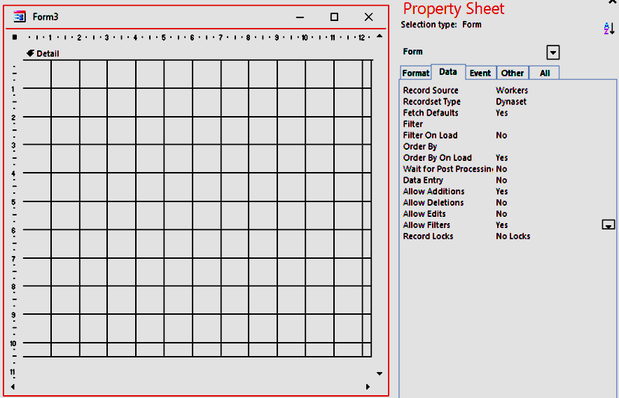
Once the form is linked to the underlying data, we drag the appropriate fields on to the form as shown in Fig 2
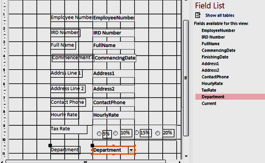
Looking carefully at Fig 2 we notice that two fields are missing from those specified in the conceptual model: Finishing Date and Current. The reasons for this omission are:
Leaving the finishing date and the current field out of the form reduces visual clutter (Developers, 2013). This will also reduce user distraction (Johnson J. , 2008, p. 242), which, in turn, will allow them to be more productive and have a more pleasant experience.
Go to topOf the text boxes shown in Fig 2, we can apply error prevention to all of them except for FullName, Address1 and Address2. The reason we cannot apply any error prevention to those is due to the uncontrolled variety of names, surnames and places of residence.
Employee Number: We stated in the conceptual model that this field was to increment automatically as each new record was added.
Since the field is updated automatically there is no need to show it on the form anyway, but its presence there will give the user feedback on whether the system is working or not. This is due to the fact that when we are on a blank record the control will have a placeholder of New(), whereas once the user enters data into any of the fields the placeholder is replaced by the newly calculated Employee number. This is one way of keeping the users informed about what is going on through appropriate feedback (Harley, 2018).
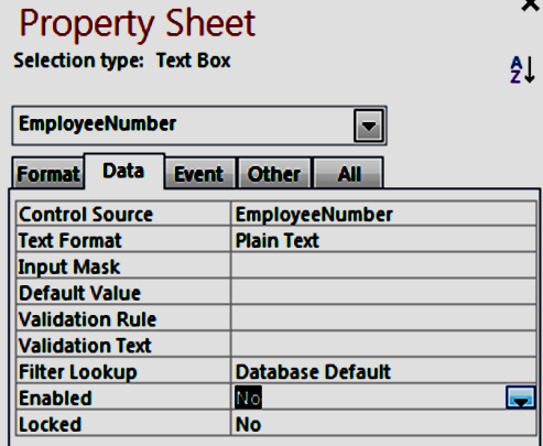
We disable the control by changing its Enabled property to No as shown above, thus preventing the user from accidentally tampering with it
RD Number:The conceptual model stated that this number should be a text field displaying eight numeric digits. Possible errors here would include entering more or less than eight characters and entering nonnumeric characters. These are referred to as slip errors (Norman, 2013).
Containing those errors involves guiding the users to stay on the right path – entering eight numeric digits in this case. One way of doing this is limiting the users’ options so that they are constrained to using only data that is acceptable to the current field (Laubheimer, 2015).
Below in Fig 4 we use the Validation Rule property to apply constraints to what the users can enter into the field.
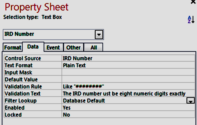
The rule specifies that each of the eight ‘#’ characters after the Like keyword must be replaced by a numeric digit in the range 0 – 9. As there are eight of those characters, eight numeric digits must be entered. There is no guarantee that the user’s correct IRD number has been entered, but at least the value entered is in the correct format.
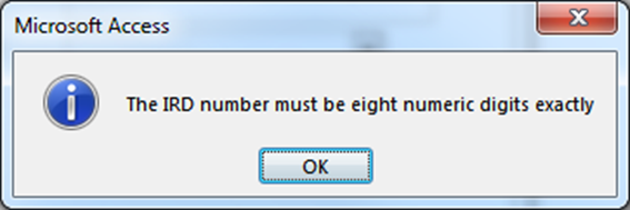
If the data is error free, nothing happens, and control passes to the next text box. However, if the user has made an error, the error message shown in Fig 3 5 will appear. Notice that the text there is the value of the Validation Text property in Fig 3 4.
Providing good error messages is an important part of good user interface. The language of the message should describe what went wrong and give suggestions on how to remedy the problem. This should be couched in polite, jargon free and non-aggressive language (Nielsen J. , 2001), (Johnson J. , 2008, p. 173) (Cogswell, 2004, p. 647).
The message in Fig 5 conforms to the above suggestions. The information icon signifies that the message is simply information while the text of the message tells the user exactly what went wrong and how to recover from the error (Tidwell, 2010).
Contact Phone: The format for this field is similar to the IRD number, i.e. both contain numeric data but are treated as text. The only difference is that the area code is between brackets and the other seven digits are broken up as a group of three followed by a group of four. Instead of a Validation Rule and Validation Text we use an Input Mask.
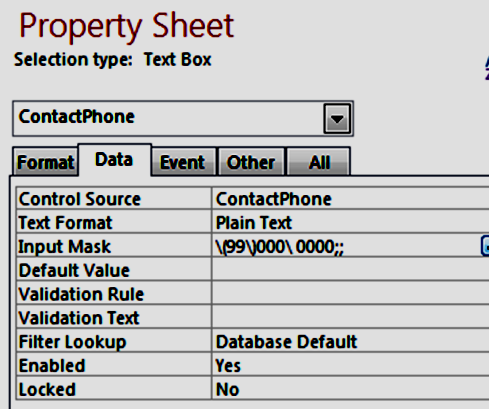
The mask in Fig 3 6 is interpreted as follows:
Entering nonnumeric characters here is not a problem; they are simply rejected with a beep from the system and once all the digits are entered the phone number is neatly presented as shown in Fig 8 below.
However, if the user exits from the field without completing all of the digits, the system throws the very unfriendly message shown below. This is one of the drawbacks of the mask.

Like many of Access’ error messages, this is rude and is of no help at all regarding correcting the error. It does not say exactly what the user did wrong or how to go about correcting the error, thus leaving the user both confused and irritated. This type of error message should be avoided at all costs.
“An error dialog should be polite, illuminating, and helpful. Never forget that an error dialog is the application’s way of reporting on its failure to do its job, and that it interrupts the user to do this ” (Cooper, Reimann, Cronin, & Christopher, 2014, p. 647).
Commencement of Employment: The data meant to go into this text box is the date that the employee started working with the firm. The text box must therefore be signified as being of type date. As a date it can potentially cause great problems. The reason for this is the variety of ways a date is presented. As an example the first day of the month of August, 2019 can be written as 1/8/2019, 8/1/2019, 1-8-19, Thursday 1st August 2019… and the list goes on!
How a date is interpreted by a computer depends on both the operating system itself and the software that is using the date. This should be a nightmare for any form designer!
Wrong! For once MS Access comes triumphantly to our aid with its date picker or calendar object. Once the date field gets the focus a calendar icon appears beside the field as shown in Fig 8 below.
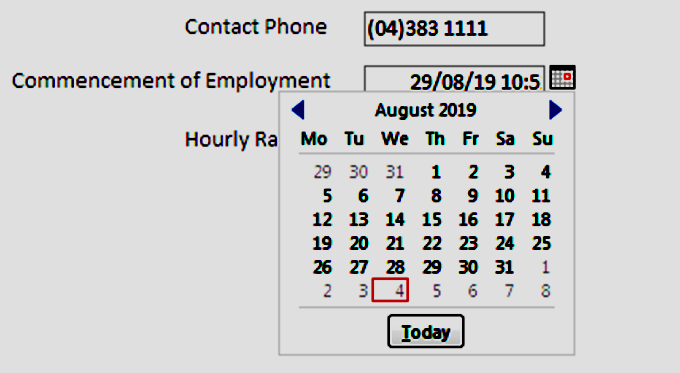
This allows us to scroll to any month we want and from that month pick the date we want. This feature of adding items from the non-digital world to a form is Nielsen’s second heuristic: Match between the system and the real world. In the non-digital world, we are familiar with calendars and have always known how to use them. Bringing them into the system here allows the user to manipulate an object that they are familiar with in the physical world and thus make their work more satisfying and less tiring (Kaley, 2018). Also, it frees the user from fretting about the variety of date-presenting conventions both in the real world and their implementation within the computer system. This also enhances the learnability of the system (Cooper, Reimann, Cronin, & Christopher, 2014).
Hourly Rate: In the conceptual model we stated that this must be a number between 20 and 80, i.e. the lowest and highest hourly rate the company offers. We must therefore constrain the values entered into this field to these limits.
Fig 9 below shows how this is done. The Validation Rule of the field has been set to >=20 and <=80
In English this translates as greater than or equal to 20 and less than or equal to 80. Any number outside of those constraints will be rejected.
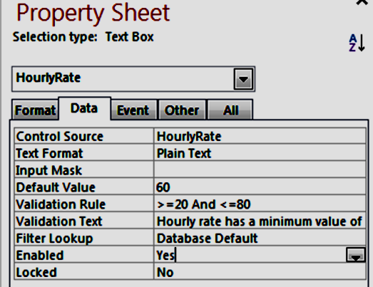
Notice also that as well as the validation rule, we have a Validation Text as well. The value of this property, which is only partially visible in Fig 3 9, is the text of the error message that will be displayed if the user enters a number outside the range 20 – 80.
Another problem here is that the user probably may be not aware of the restrictions on what is allowed into this field. Therefore, to give them some guidance we can give the textbox a tooltip. Below in Fig 10 we see how the tooltip is implemented. In the form, when the user hovers over the textbox the tooltip is revealed as shown in Fig 11.
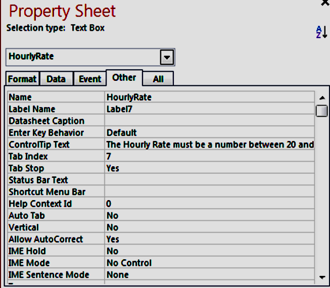


Above in Fig 12 after the user had entered a number outside of the given range, an error message is raised showing the contents of the Validation Text property. You can clearly see behind it that the user entered 90 for the value of the hourly rate.
Here the system is being very generous with the user. The label clearly indicates what data is to go into the textbox, the tooltip indicates the range of values that are allowed and if all else fails the error message explains in plain English what went wrong and how to fix it. This respectful and helpful interaction will contribute towards a good user experience (Cooper, Reimann, Cronin, & Christopher, 2014, p. 457).

In Fig 13 we see the group of radio buttons in action. Depending on which of them is pressed, one of the values 5, 10, 15 or 20 is stored in the HourlyRate field. If the original mapping on to the tax rates is correct, this is an error free control, which provides a certain amount of data immunity (Cooper, Reimann, Cronin, & Christopher, 2014, pp. 327, 645).
Department – Using Combo Box: The Department field specifies which of the company’s departments the employee works in. The names of the departments are: “Customer Service”, “Online Orders”, “Accounts”, “Confectionary”, “Fruit & Veg” and “Bakery”.
Although those values could have been typed into a text field, this would cause a number of problems for the users:
To remedy this, we use a combo box. This control has a drop-down list into which we insert the names of the departments. With this, the user is freed from spelling errors or having to recall department names and once again committing errors is fairly difficult (Cooper, Reimann, Cronin, & Christopher, 2014, pp. 327, 645).
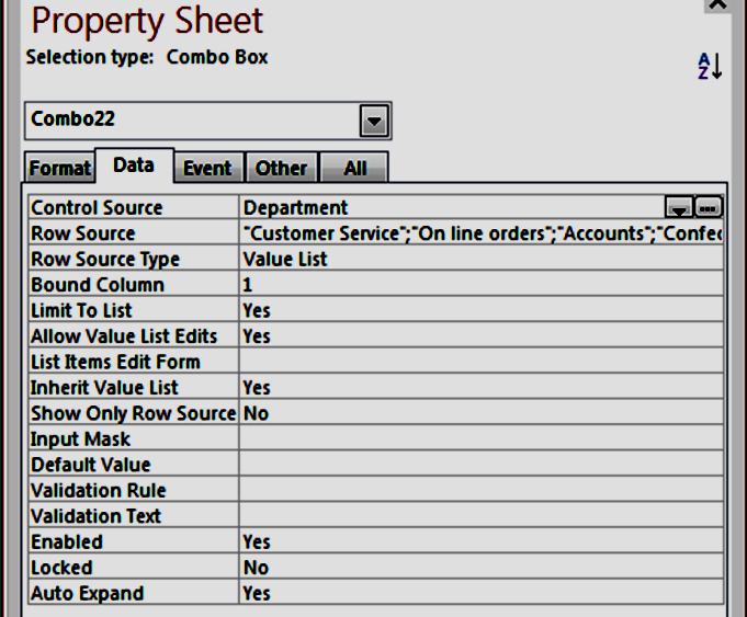
Above we see how to provide values for a combo box’s drop down list.
Go to topThe subtitle of this lesson is Error Prevention. Thus, naturally enough heuristics #5 Error Prevention and #9 Help users recognize, diagnose, and recover from errors are included.
#2 Match between the system and the real world involves using skeuomorphic features to make the user’s task more pleasant. In our case we used the calendar object so that the user could use a representation of a real-world object to select a date. This had the effect of also helping the user enter correct data, thus enhancing error prevention.
#6 Recognition rather than recall was applied when designing the radio buttons and the combo box. The primary goal of this heuristic was to make the user’s task more pleasant by not overtaxing their memory, but in both cases, it also ensured that only acceptable data could be entered into the system – again enhancing error prevention.
#8 Aesthetic and Minimalist Design involves removing unnecessary clutter from the form. In our case it means that two data fields, which are not required for new employees are not available on the form and thus prevents the user from accidentally entering inappropriate data – again, error prevention!
Go to top